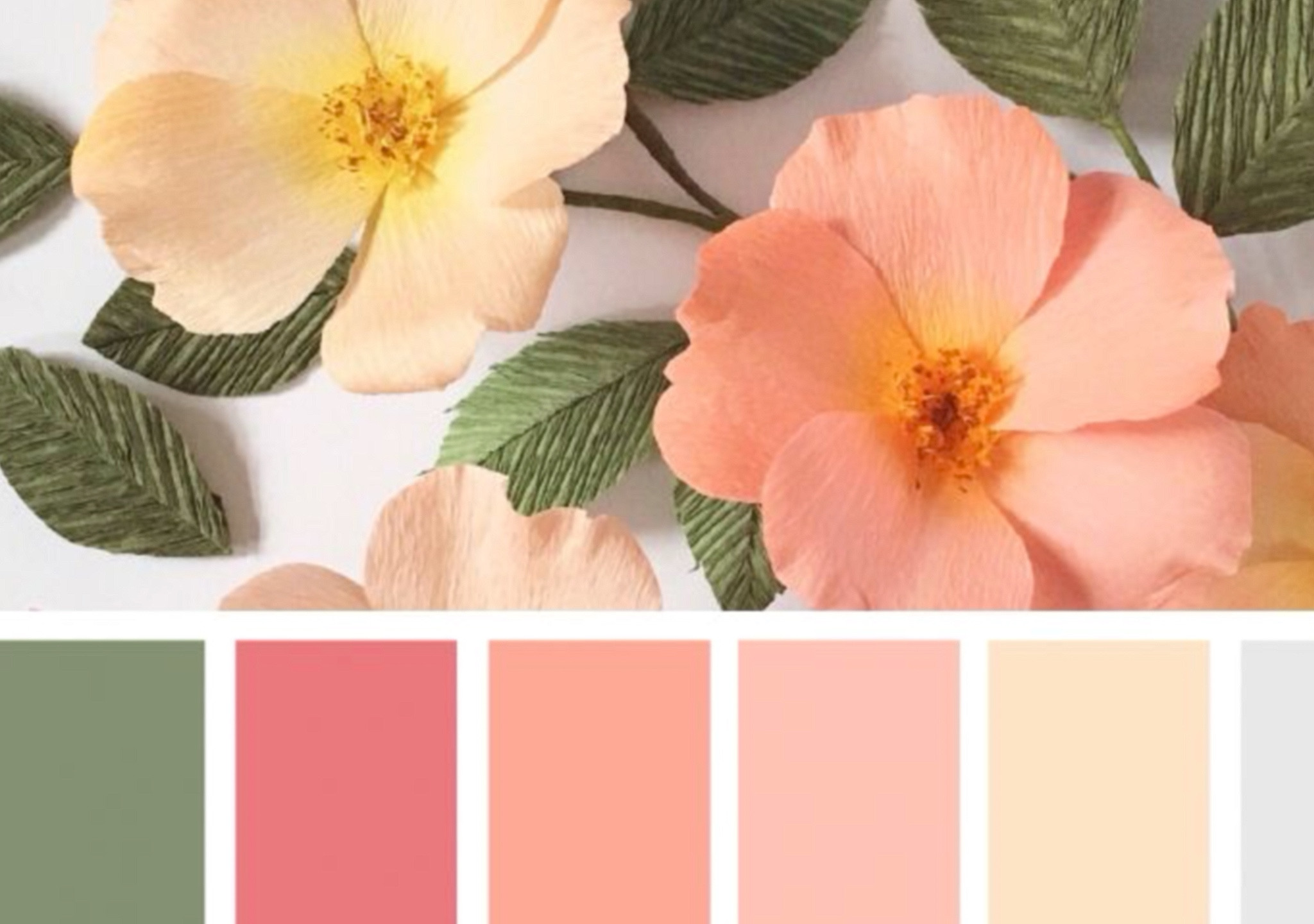
I have seen so many budding artists expressing doubts about choosing colors. As I am a huge fan of choosing colors according to color theory, I believe a good understanding of the theory can help a lot. Color theory is a set of principles used to determine which colors will look visually appealing when used together. It is based on the idea that certain combinations of colors can create harmony and balance, while others can create tension and dissonance.
One of the key concepts in color theory is the color wheel, which is a visual representation of the relationships between different colors. The color wheel is divided into primary, secondary, and tertiary colors. Primary colors (red, yellow, and blue) cannot be created by mixing other colors and are the building blocks for all other colors. Secondary colors (orange, green, and purple) are created by mixing two primary colors. Tertiary colors (yellow-orange, red-orange, red-purple, etc.) are created by mixing a primary color with a secondary color.
Another important concept in color theory is the color scheme, which refers to the combination of colors used in a design or work of art. Some common color schemes include complementary, analogous, and monochromatic.
Complementary colors are colors that are opposite each other on the color wheel, such as blue and orange, or red and green. These colors tend to create a high level of contrast and can be used to create a bold, eye-catching look.
Analogous colors are colors that are next to each other on the color wheel, such as red, orange, and yellow. These colors tend to create a harmonious and cohesive look.
Monochromatic color schemes use variations of a single color, such as different shades or tints of blue. This can create a cohesive and sophisticated look.
By understanding color theory and using it to create effective color combinations, artists and designers can effectively communicate their ideas and emotions through their work.